My Documentary Influences

Werner Herzog

If I had to pick one director who was to be an influence on my vision and thoughts on documentary, it would be that of the maniac known as Werner Herzog.

The only documentary I’ve watched by him is Grizzly Man – in which he narrates over an archive of a seemingly insane man who wants to live out in the wild with the bears. He takes a very humanistic approach, showing clear sympathy and attempt to understand the man and his intentions. It’s a tragic and real story and Herzog often lets the archival footage speak for itself, but also inserts plenty of context.

This was an interesting experience, but as a documentary filmmaker, often great footage doesn’t just find itself to you. To say I had a lot of influence from this specific film would be missing the point of what Werner Herzog is about. It seems known that Herzog isn’t one to stick strictly to fact or fiction; Many of his fictional films have been very heavily based on reality, and even contain real hardships of crews and dangerous stunts required of actors. To hear this is inspiring to me as a filmmaker – while I’m not set on trying to put anybody in dangerous situations, I can understand wanting for something to be as real and legitimate as possible – and this is all the more applicable in a day where many people turn to practical effects to do things.

To point out some extreme examples of the kind of director Herzog is, the biggest one would be his film, Fitzcarraldo (1982). It’s not a documentary, but it was apparently an absolute struggle of a film to make.

“Without dreams we would be cows in a field, and I don’t want to live like that. I live my life or I end my life with this project.” This is a quote he said during filming Fitzcarraldo. The reason this film was so difficult was that it contained a ship being dragged up a mountain. As interesting as an idea it was, to have a cast, crew and extras do this was insane. The film itself was about an insane character, and perhaps Herzog got lost in that mind frame. An earlier project with Fitzcarraldo’s actor Klaus Kinski would also reveal that the two have had a respectful but simultaneously very difficult relationship working together – to a point where upon saying he would quit, Herzog had to threaten that he would kill the both of them if he did. This all sounds crazy, but I think there’s something in there – something to respect and live by about filmmaking and how seriously it can (and perhaps should, even if on a lesser scale) be taken.

One other insane thing he did was not so dangerous and horrible, but instead could be considered inspiring: Challenging Errol Morris to finally make and complete a feature documentary. He promised Morris that if he would, he would eat a shoe. So, Errol Morris completed a feature – and that’s exactly what Herzog did (as per short film Werner Herzog Eats His Shoe (1980) by Les Blank).

Errol Morris

Errol Morris is a documentarian known for his invention of a form of interviewing; In documentary, a subject must often look at the interviewer, who is required to be as close to the lens as possible so that the subject has a point of eye contact to be talking to, while also allowing to almost be looking straight forward towards the camera and therefore the audience, but Morris instead created a device that allowed his subjects to look at him while simultaneously looking right into the lens (The camera lens is behind a video feed of Morris, whom they look into as he speaks to them).  The main film I have seen by him is Standard Operating Procedure (2008) and it contained many elements I enjoyed.

While I found it interesting to have good editing, music composition, and as mentioned, the use of a more engaging interview style, what stood out to me was the use of its archival footage and the visual / artistic re-enactments that took place throughout the film. These were certainly what kept the flow of the film going, and what kept me immersed. All of these elements working in unison added a level of drama and tension to what was already quite an interesting story about the abuse and torture going on at the Abu Ghraib prison in Iraq in 2003.

There definitely felt to be an objectivity too, in trying to see all the sides of the story. Really, by the end, nobody seemed to come out looking like a ‘good person’ – everybody had made their part in the mistake of letting the abuse happen. And I think a documentary shouldn’t be trying to sugar coat everything – it should be showing it how it is and let the audience decide where they stance on how good or bad a person is. However, the director should also have a moral scale to allow people to understand why they think this is good or bad – but Errol does this in a very non-intrusive way.


FILM REFERENCES

Herzog, W. (Director). (1982). Fitzcarraldo [Motion picture].

Herzog, W. (Director). (2005). Grizzly Man [Motion picture].

Blank, L. (Director). (1980). Werner Herzog Eats His Shoe [Motion picture].

Morris, E. (Director). (2008). Standard Operating Procedure [Motion picture].


OHANA – Feedback

Recently, I had the role as being the editor of a film about an australian female gridiron team known as OHANA. It mostly followed 3 of the girls on the teams, and showed their training and a bit about themselves.

On Friday, the documentary that I have been editing until Tuesday was screened before an audience of my classmates and a panel of judges. The feedback given regarded a few elements, many of which I had already considered.

The positive feedback was that the choice of music and editing / rhythmic pacing to it was fun, and that it therefore made the documentary an enjoyable and easy to watch experience.

I was very happy to have all of this acknowledged, as my director, Dan, and I spent a lot of time picking music that would suit the training montages we were creating. On one hand we needed to pick music that would accurately represent the girls, while on another the music needed to fit a montage, and also still work within our own tastes as creators. I also spent quite some time with sound editing to make sure the songs went on long enough and didn’t end too awkwardly.

Nonetheless, we spent a lot of time on that and we believe it paid off. The girls initially had some complaints about the final montage’s song for what I personally believe was a petty reason (that the song came off more towards cheerleading than the idea of women in football) and ultimately, was after I had just edited the montage to work at the song’s pacing. A lot of the shots contained many happy accidents that allowed me to keep more than I would have in order to stay in rhythm.

Other feedback we got from the panel was that there should have been more of the boxing. Dan was saying this time and time again, but I disagree. I think in the end we showed the right amount of boxing. To assume that the boxing montage could have gone longer is probably a disregard for what was in my head – the idea that there would be a very quick turning point in the audience’s mind where suddenly it’s gone on too long. I feel that we showed just enough boxing, and anything else would have been repetitive. Dan and I of course came to an agreement about the amount of time we spent showing the boxing.

Most of the other feedback was not really to do with editing and therefore probably quite irrelevant to me, but I will touch on one other thing that was stated – that the ending montage was too much of a ‘fetishization’ of females playing gridiron.

Dan and I had already discussed this, when I told him that I honestly felt a little bit uncomfortable about what we were making a montage out of. However, we agreed that these women were more than happy being depicted this way on the day we shot it. In fact, even from the day we met them they joked around about getting them ‘twerking’ and going out clubbing on camera – these are ladies that are proud of their bodies – the only problem is that the panel seemed to not have that conveyed to them. I do feel like I’m responsible for this in some regard, that through the editing I could have made this more clear. But I can’t think of how, and ultimately I think it was still a low jab at our film. Many things like to ‘sexualize’ people / things and it’s never something that simply occurs without any stage of approval. A judge also contrasted that he enjoyed the montage at the end anyway, so I guess it comes down to the specific person and how comfortable they are with that kind of content – but I think the key thing to take away is that the women were more than happy about it all.

I still am very proud of my work given all of the feedback I’ve received, and really if there were two additional things I would do, they would be:

  1. To see if the boxing could go on longer, just to confirm.
  2. To give it a good old colour grading.

Whether or not I will colour grade it will depend on time, this week. But I guess we’ll see!

Going Clear: Scientology and the Prison of Belief (2015)

A Two-hour film that documents where Scientology came from and its continuation into modern society. I will be analyzing what this film is about and conveys, as well as its directorial style by Director Alex Gibney, who has made many other Documentaries such as Taxi To The Dark Side (2007) and We Steal Secrets: The Story of WikiLeaks (2013).

This documentary firstly follows the history of Scientology’s founder, L. Ron Hubbard. This is told through both audio tapes and interviews of him, and interviewees such as an ex-wife of his. The story follows and unfolds Scientology’s psychological effect on people and what their group aims to do, and how it traps them, also through continuing to interview many different people involved in Scientology.

Going Clear is envisioned through showing archival imagery, video footage, and slickly designed titles and graphics. There are slow motion / out of focus and close-up recreations, and quick pacing to avoid distraction over the recreation’s realism. B-roll is similarly shot. Dark and ominous music is also used throughout this film to help evoke a feeling of dread over the negative experiences being told of these subjects as a result of Scientology.

The interview style consists of subjects framed either on the left or the right of the screen, in a narrow focus. They are captured from two angles, one more straight ahead where the subject is looking just off from where the camera is placed at the interviewer, or one that’s more on their side that is more likely zoomed in. The zooming and editing is often used to get closer into the subjects’ faces when they are talking or recollecting something more personal.

The Flogsta Roar (Short Doc. Analysis)

ABOUT: A documentary about various people living in Flogsta, a neighbourhood near Uppsala in Sweden, who every night at 10pm, would all scream out their windows.

This documentary explores different subjects and their stories:

A group of people growing irritable about their food being stolen from their shared fridges.

A young girl who likes to paint, and play her piano and sing.

A girl who is hiding her love for a boy.

An orchestra playing in a room.

A man who wears a mask when he’s not in his room.

These stories are all told to help give depth into why these people choose to scream every night.

The documenting is people being interviewed in their rooms, intercutting with B-roll of what they do, be it hanging out and talking with their friends, or being alone with their hobbies.

What makes it interesting to watch, is a strange and almost ritual daily event, and an exploration into the lives of the kinds of people who partake in it. The filmmaker’s intention is to find some kind of overarching reason that it occurs. The people living there also give insight into different stories they’ve heard about the origin of the event.

The editing and sound design is also well done, through the use of bringing all of the characters closer through juxtaposing one story’s noise, but having it continue in the next scene as if it were a wall away from the story being jumped to.

The interview style seem to be based heavily on the environment of their room, trying to capture their environment and often having them sitting at their bed or a chair they’re often at. One story of a guy talking about his plant is interviewed with his plant shown in the background. A girl who stays in her room a lot is shown from more of a distance, and in the dark of her room, with various paintings in the frame. There are no questions heard that the interviewer is asking. The interview styling is thus trying to reflect upon and capture these people’s personalities and how they live at this place.

 AND SO! MODALITY.

Bill Nichols posits that there are six different ‘modes’ of Documentary. These six modes are Poetic, Expository, Participatory, Observational, Reflexive and Performative. He therefore concludes that every documentary dominates in fitting into one of these six categories. And which would this short-form documentary fit into?

The answer is that it is a Performative Documentary, with elements of Poeticism and Observationalism – but at it’s heart it’s Performative. The reason for this, is that these are characters who are all being given their chance to have their opinion shine – be it why they think the Flogsta Roar began, or simply how they believe how one (or rather, themselves) should be living their life.

Nichols states, “Performative documentary underscores the complexity of our knowledge of the world by emphasizing its subjective and affective dimensions.” This is exactly what the film aims to do, and very much explores into. Not interesting is the fact that all these people roar, but instead why they all choose to participate; what motivates them to allow themselves to be part of such a strange and unknown event.

The rest of the film plays out in a more poetic scene where it feels timeless (as this day in their life is every day for them) and like a mythical place in the middle of Sweden (and perhaps in a sense, it is!). These of course, come with an observation of these subjects’ lives, and allowing a chance to see what they’re like objectively – hence Observationalism comes into play.

Michael Renov, however, would posit that there are four forms, or rather “modalities of desire”that come into play in a documentary film – and that a film is always a blend of the four. These four practices are: [To record, reveal and preserve], [To persuade and promote], [To analyze and interrogate] and [To express].

So, to declare which of these four modes The Flogsta Roar leans mostly on – I would say the first and fourth. The heart of this documentary is that it records these lives, and allows them to express who they are with seemingly no startling push or interruption from the filmmaker/s. This is a chance for a town of seemingly unhappy people to voice what they wish to – and that is what it means to express. There is perhaps some analysis going on, but it’s for the viewer to do, ultimately. The filmmaker’s perspective is not one to try and enforce an opinion.

REFERENCES:

The Flogsta Roar. (n.d.). Retrieved May 11, 2016, from https://vimeo.com/148369281
Nichols, B. (2001). Introduction to documentary. Bloomington, IN: Indiana University Press.
Renov, M. (1993). Theorizing documentary. New York: Routledge.
Juhasz, A., & Lebow, A. (n.d.). A companion to contemporary documentary film.

Introduction to Documentary

THIS IS IT!

On the first (and second, so far) week of my delve into Documentaries: I had a change of heart moment. I can’t say I’m a big fan of watching documentaries, so to make them felt like it was going to be painful. I already know how much effort and exhaustion can happen out of B-roll and editing a documentary in general, and this would be my first chance to see that process from the very beginning of pre-production which I can’t say I was looking forward to.

However, what I was ignoring was the passion that Documentary can convey. One thing that concerned me most of all was my idea of finding an idea that I would truly feel interested and passionate about, but last night I concluded three different ideas. They aren’t necessarily my three assignments, but it was the first time I saw a documentary I’d be interested in making. I realized the aspect that I wanted to go into Documentaries with, and that was learning about people and the things and ways they can be different and/or similar – how each person separately lives their life.

And, on a philosophical, psychological and sociological level, there is much to delve into. To work out a person and what they’re about is a great achievement in itself, but to share it with the world in documentary format towards an overarching theme can be a truly interesting experience – one that hopefully everybody can find some relation to.

I don’t intend to go further in detail about what I am planning to pitch or do for my assignments at this stage, however I will post any documentaries (and perhaps, outside work) on this blog. Right now, I’m just seeing the first step in my progress that I needed – to find my passion and begin considering my angle about the kind of subjects I’m focused on documenting.

My intention is also to try and watch more documentaries, and so I also hope to reflect upon anything documentary-format I watch on this blog too.

Woo!

Colour Grading: Rinse and Spin

Our web series, Rinse and Spin, relies on different genres for each of its four episodes. One way stylistically to add an extra tone to each episode is through the colour grading. While the series’ colour grading should remain somewhat consistent, each episode could have subtle differences from each other to reinforce not only the show but its genres.

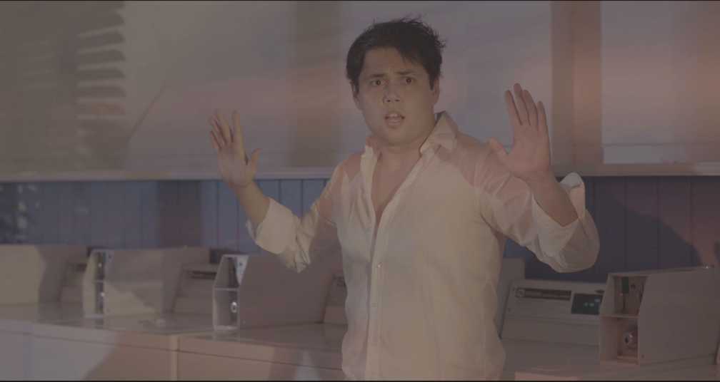
Rinse_Spin_Ep1.jpg

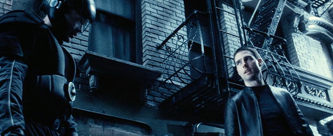
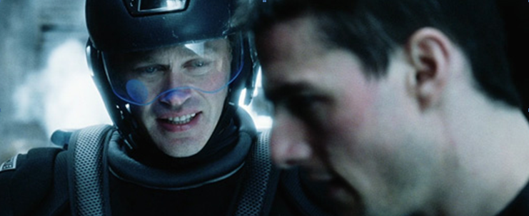
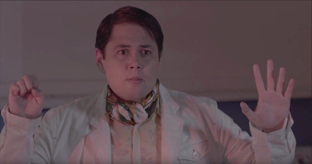
For the first / pilot episode, there is no typical ‘genre,’ but it sets up the show’s themes of being not only a bit goofy, but also having sci-fi and thriller elements. With this in mind, I think stylistically the best approach to have the pilot episode (and thus also the rest of the series) have a colder / blue tone to it to conform to sci-fi. One popular example of blue being the main tone in a sci-fi movie is Steven Spielberg’s Minority Report (2002), as shown in an example below.

2015-12-17_00-14-28.png


2015-12-17_00-14-42.png

However, Minority Report also has a washed out and often highly exposed lighting to it with the intention of intensity, and while our show does have ‘standoff’ moments, it still has a comedic aspect to it, so having a balance in colour would be ideal. I would therefore keep exposure somewhat contrasted / balanced, with a lighter tone in this particular episode. The intention would be to keep the whites and blacks looking how they are meant to, and to keep colours more-or-less how they looked on set, but with the colder tone and in this particular episode, a raise in the midtones. The highlights would likely stay as they are, as long as what’s “white” is white.

Rinse_Spin_Ep2.png

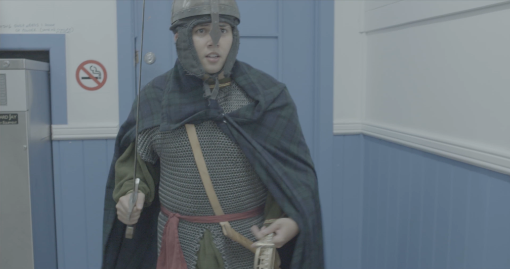
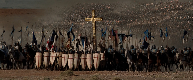
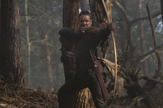
The second episode represents the character coming back from a medieval era, and so this should help inform the colour grading style. Looking at modern films that take place in the medieval times, these films seem to give off a gritty feeling. While, to some degree, the colours of the costume design inform the grading on some level, the main colour that these films seem to lean on is shades of brown. This is to make it feel dirty and gives it similarity and workability with the colours of the costumes.

Two examples of this would be two Ridley Scott films.

2015-12-17_00-14-54.png

Kingdom of Heaven (2005)

2015-12-17_00-15-03.png

and Robin Hood (2010).

These films do have grittier tones to them than the medieval episode, which is more comedic, and so shouldn’t rely on having darker shadow tones like the examples. Being that the setting of these episodes are in a Laundromat, and so there aren’t large hills / plains and forests serving as the background, brown would have to be worked in more subtly, being used more-so with shots that look outside more. This would also suit to continue involving more blue in other shots to stay consistent to the previous episode. Overall, I would keep the midtones and highlights similar to the previous episode, keeping in mind that the costume design in this episode is darker than the previous, and generally would involve more contrast and less white colours.

Ep 3.png

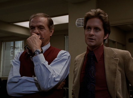
The third episode is stylistically based around 70s cop shows, having a darker tone in terms of the story and beginning to stick to a more serious turn. With these elements in mind, this episode’s grading, I believe should have a darker appearance than the others in all aspects – instead of relying on being mostly bright, it should now be involving more dark tones into it. The lighting on set contains red-pink tones as well as a bit of blue, to involve the two colours of cops. As a reference, I have looked into a few 70s cop shows, one example being The Streets of San Francisco (1972-1977).

2015-12-17_00-15-12.png

Upon looking into the colour schemes of these shows, the tones seem to be rather dark, especially in the shadows and midtones, and even the higher tones aren’t incredibly lit up. However, being old shows, the colour scheming is rarely balanced towards a colour. Given that the lighting of our third episode has red and blue, it would be best to work with that and even tone the red back a little bit to keep it close enough to the rest of the episodes. The midtones and shadows should be darker to give off the thriller-leaning vibe and to reflect typical cop shows, but the highlights should be a bit lighter to make sure the lighting doesn’t look too dissimilar from how lit up the Laundromat was in the previous episodes.

Rinse_Spin_Ep4.jpg

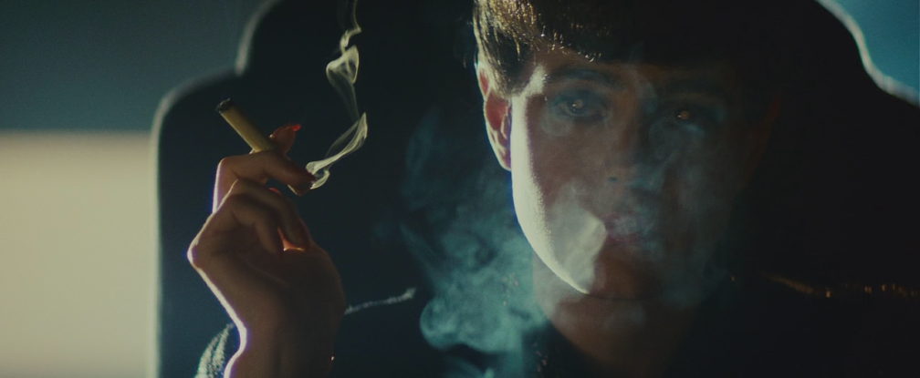
The fourth and final episode takes the style of film noir (in a neo-noir context) as part of its storytelling, and therefore its lighting, and so it should go to follow to conform to these for its colour grading. Given that this genre stylistically relies a lot on its lighting, and it is the finale of the series, this episode will be colour graded especially different and darker. The reference point for neo-noir I have chosen is once again one by Ridley Scott: Blade Runner (1982).

vlcsnap-2015-12-16-21h16m57s376.png

The film, alike most noir films, relies plenty on shadows and darker scenes to build mystery and suspense in the atmosphere of the film. The very same may be done to Episode 4 through making the shadows and midtones lower. Having the same sci-fi blue tone from Episode 1 would be a nice way to bring things full circle, the only difference being that now our character has been through an adventure and got into trouble, allowing for a much more grim style than the original episode.

COMPOSITING PART B

PART B: Tracking / Compositing

In order to track the new logo onto the perfume bottle, we used Mocha, which is an image-based tracker, making it most efficient when it is tracking a surface that rotates / moves in perspective as little as possible – in order to track with Mocha, you specifically feed it a plane to track.

After drawing up a plane to select, I tracked forwards and it rendered frame-by-frame where the plane was moved, based upon the images it saw in the previous frame/s and where it went.

While tracking backwards the footage where the perfume bottle went back off screen, I changed the min % pixels used to 20 so that only 20% of the plane needed to be on screen in order to have tracking working in each respective frame.

Pen tool.PNG

Once I was done tracking, we exported the tracking data – picking the option to export the transform data into after effects. In After Effects, to transfer this data, I made a Null object and pasted the tracking data into it.

Using the pen tool, I drew around the outline of the perfume bottle in order to be able to isolate it and add more colour grading to it specifically. I used the soft feather tool under the pen tool’s context menu to add feathering to the drawing of the pen tool I used. I then made the null object’s layer with the tracking data a parent of the object I drew with the pen tool, so that my outline of the perfume bottle would track along. I transformed the pen tool’s locations so that it would transform with the perspective throughout the footage’s play through. I then went and colour graded the isolated perfume bottle.

COMPOSITING PART A

PART A: Colour Grading

One task we were assigned to do was to shoot footage for a ’TV Commercial’ where we had a perfume bottle, which we would have to colour grade and put a new logo on top of.

When we used the Sony FS7, we shot with s-log 3 on – this was in order to give us an optimal chance to do colour grading. I have done colour grading before with DaVinci previously, but hadn’t done so within Adobe Premiere until now.

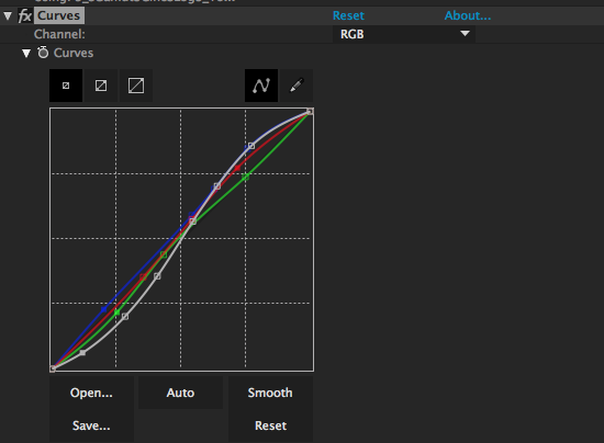
In terms of colour grading, what I am most to using is curves so it was good to see Adobe Premiere also shared this feature. I used the curves for it overall to raise the highlights and lower the shadows and create more contrast in the video, as well as raising the mid tones to make the footage not so dark. I tinkered with the blue curves to add more to it in the highlights to make the warm and tungsten-y colour feel more white-balanced and cool looking.

Screen Shot 2015-12-03 at 4.26.59 pm.png


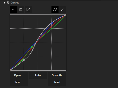
I used another set of curves on an isolated selection of the perfume bottle, where I tried to make it feel even brighter from the rest of the footage. The rest of the footage had lights out of focus in the background, but the perfume bottle I wanted to look brighter and stand out compared to the rest. So, I gained more of the midtones and lowered more of the shadows, and comparatively put the greens and reds down a little bit more.

Screen Shot 2015-12-03 at 5.20.05 pm.png

Overall, I still would prefer using DaVinci to colour grade, but I’m glad Premiere has the curve features as that’s what I primarily use when I’ve colour graded.

Week two: A reflection

Week two: A reflection

So, this week has involved more brainstorming and writing, which as usual for me is tough. With creative restrictions, it gets much tougher, but it’s more likely to achieve results.

We as a class have been developing an idea for a webseries, and the episode our group was given involved the ‘middle ages’ in our time-travel related series. And while I found the confinements confusing, I believe that I possibly overloaded myself and my group with too many questions while we were trying to write and decide on ideas for something that, at the end of the day, is just going to be 2-3 minutes.

Last week also had a workshop class where we focused on making a product look nice for a TVC (Television commercial) which was some more fun experience. This time I didn’t have any specific role, but I just tried to help out anywhere I could and take as much in from the process as possible like always.

Otherwise, the only class-related things that I could reflect on is that I, even almost a week later, feel discouraged about our presentation we had to pitch last Tuesday. (I think it was Tuesday, I have a bad sense of time.)
These kinds of tasks stress me out to the point where I’m always keen to get them done, but when I feel ‘done’ it always makes me think that the end result is going to be something great, so when such isn’t the case I can find it devastating – that’s something I need to improve on. My ideas seem to always feel incomplete, even to myself, and even when it’s contributing to other people’s ideas too and believing i’m completing those. But I guess with enough practice I’ll continue to become a better writer and I guess a better innovator?

I’m finding it hard to properly think of good and new, interesting stuff to post on my blogs, so maybe I should try and adopt some kind of question I ask myself each week that relates to where I want to be – as for what question each week I will probably outsource. I will try post something this weekend to reflect on this week (3).

And Back

Time to start blogging again, and sticking to it. The intention is to try update it at each week’s end, but I won’t limit myself to that.

This week we were given two tasks; One of finding good, local locations near us, which we had two days to do so. I walked around both of these days to look for places that ‘stood out’ to me, with disappointing result.

There was one bar which I liked but soon found my phone took terrible photos, and the lighting within it didn’t help (Which wouldn’t be a problem on a set, mind you – artificial lighting and all). I also found a restaurant which had nice flora and design inside it, but upon requesting to take photos, they told me I was only allowed to take photos from outside, so I didn’t bother with it – this would be a red flag for somewhere to potentially film. Otherwise all that stood out well to me was churches, which I also considered would result in difficulty filming in. The bar I found there seemed to be no problem, and I soon found out that a classmate had actually done work there before. But lighting would be a problem, and I wasn’t sure if the bar even had enough character to be a good location. My intention is to keep looking for more places though, even though I feel lost for ideas. My reflection upon all the searching is that I don’t think there are that many great places, at least none that grab MY eye – none that stick out as a ‘character’ itself and would make a good location to revolve around.

On Thursday, we had a master class where I had the not-so-big role of being on continuity. It can indeed be a big role, but not within the context of our shoot. Nonetheless, like all master classes I’ve been involved in, it was fun and a chance at getting more experience.
[I did take some photos on the day for this blog, but no good ones. I need to invest in a new camera since the one I have seems to have a dud battery that won’t charge now.]

The second task given to us for this week was to find an object to use as a MacGuffin – which was a bit less difficult than a location. I decided my best bet would be to go to a nearby thrift shop and not to leave until I found two potential items that would work well. Without going into much description, I decided on two quite simple items one could find in any house, but their visual aesthetics were what separated them from any ordinary one and could bring them more value within a story, in a cinematic sense. Now, my intention the rest of today and this weekend is to continue trying to think of premises for a YouTube series to pitch next week. With this in mind I will probably do more location-hunting and try and decide upon a specific purpose behind my potential MacGuffins.